React Native @ The Knot: A Designer’s Perspective


For the past 8 months, I’ve been working on The Knot Pro app, which was built using React Native (a framework that lets you write an app once but run it natively on both iOS and Android).
This was my first time working on a React Native app, so I’m definitely not an expert on the framework.
However, I struggled to find design resources to help me along the way, so I hope my experience gives you an idea of what to expect and some things to consider if you find yourself working on a React Native app.
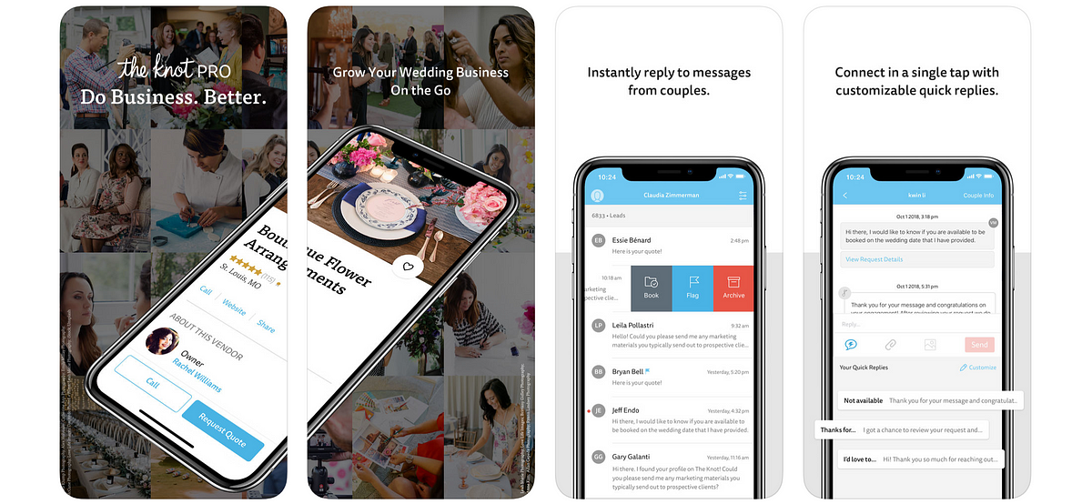
The Knot Pro in the App Store
What can designers gain by using React Native?
Delivering value to users faster
We knew that most of our customers use an iPhone, so our plan was to launch in the App Store first to gather customer feedback and make sure things were running smoothly. Then, we’d get the Android version ready to go ASAP — we didn’t want our Android users to feel left out. Thanks to React Native, we were able to launch an Android Beta with just another month of work!
The ability to release features or a whole app on a second platform without starting mostly from scratch is a huge win for your users, especially if your company doesn’t have a lot of Engineers dedicated to mobile.
Becoming an expert on iOS and Android
I’ve always believed in taking the time to consider how my work will carry over to various platforms. However, this was the first time that I actually owned experiences across iOS and Android.
Because of the way React Native works, our app would look almost identical on the two platforms by default, so I really had to keep both iOS and Android users in mind.
This gave me extra motivation to get out of my “iPhone bubble” and learn more about Android and Material Design.
Keeping a lean design system
Since a lot of our app’s code would be shared between iOS and Android, my fellow designers and I challenged ourselves to come up with patterns that would work well on both platforms.
While React Native allows you to show different visual styles and interactions on different devices, we didn’t want to introduce platform checks and platform-specific code unless we really felt they were needed (more on this in a minute).
As a result, we were able to create one design system that works across platforms and contains few platform-specific patterns.
What challenges can you expect?
Deciding when to follow platform conventions
Although we aimed to keep our designs consistent between iOS and Android, we knew that following platform conventions is a design best practice, and good for our users. We wanted our users to feel like our app was purpose-built for them, regardless of what platform they were on. And we definitely didn’t want to give them a poor experience just so we could build both apps from similar designs.
We were faced with a dilemma: do we commit to staying lean by using the exact same UI across platforms and risk creating an app that doesn’t feel fully familiar to our users? Or do we favor customizing our app to fit each platform but risk going down a path with lots of platform-specific code and experiences to maintain?
We decided to go with a mixed approach, making only certain aspects of our app platform-specific. Here’s a breakdown of our decision:
As a general rule, we’d strive to use design patterns that work well on both platforms. For example, checkboxes are more widely used in Android than in iOS, but they’re such a common pattern that iOS users are unlikely to be confused by them or to find them unfamiliar (i.e. we felt safe using checkboxes on both platforms).
That said, we decided our designs would change according to each platform when:
- React Native or one of the libraries we use automatically alters our UI or interactions to match each platform. If we get the customization “for free”, then why not take advantage of it? Some examples include toggle buttons and the alignment of headings inside our top navigation bar.
- We believe users of a platform are already so familiar with a pattern that introducing a new one might negatively impact them. An example of this is the “overflow” icon, which is represented by three horizontal dots in iOS and by three vertical dots in Android.
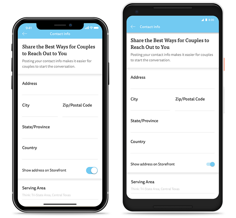
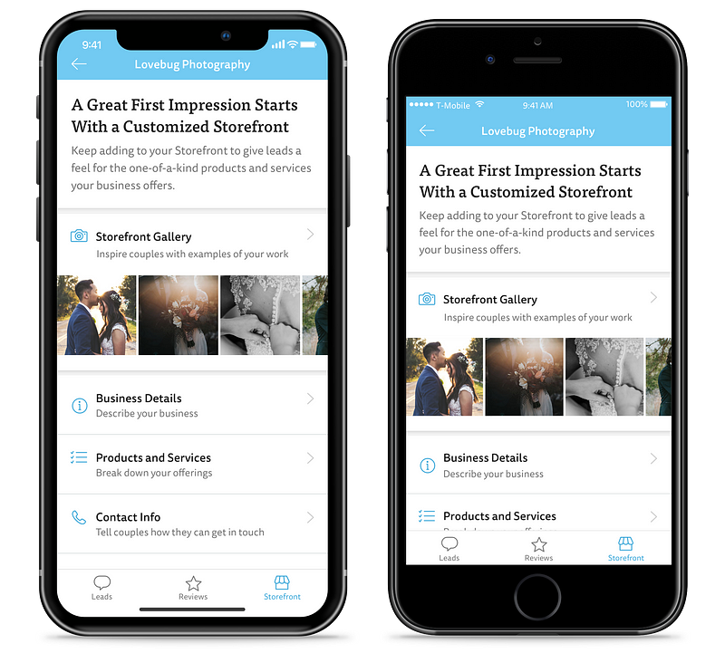
On this screen, the only platform-specific elements are the top navigation bar and the toggle button
As a full disclaimer, our app hasn’t been out for a long time so we have yet to see how well this approach stands the test of time.
You might run into similar trade-off discussions, and when you do, I’d strongly recommend aligning with your team on what you believe is best so you don’t get out of sync with others who are also working on your app.
Dealing with system differences
Even if you decide to keep your designs consistent across platforms, there are times when that just isn’t possible. Typically, this limitation has to do with differences between iOS and Android functionality.
For instance, in iOS you can only use a native alert to request access to your users’ photos once. If they say no, in future instances you’ll have to ask them to go to their settings to give you access. In Android you can trigger the native permissions modal as many times as needed, so you won’t have to direct users to their settings.
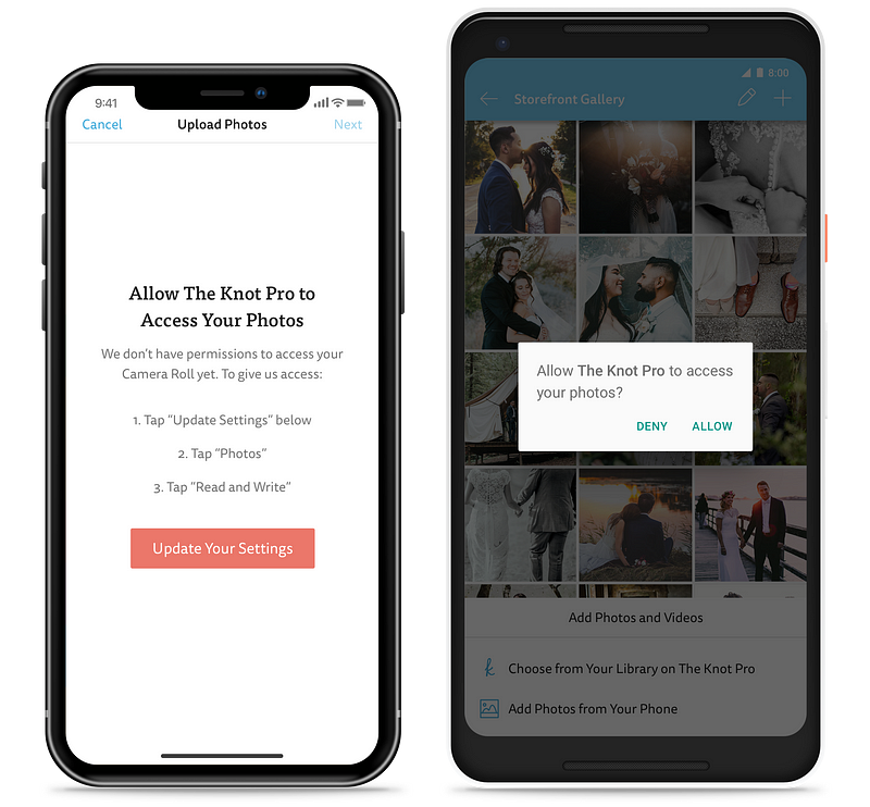
If an iOS user has previously denied access to their photos, you’ll have to direct them to their settings when asking for permission again. The same is not true on Android.
Another example of something that works differently in iOS and Android has to do with app ratings. iOS recommends that you show a native modal when asking users to rate your app, while Android has no native ratings experience.
A good rule of thumb is to check the nuances of each system any time you’re working on something that relates to settings or permissions.
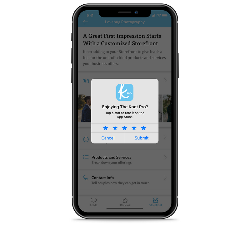
A native ratings modal is only available on iOS
Relinquishing _some_ control over finer UI details
…or pushing your engineers a little harder to find a solution.
If you’re a designer (like myself), you’re probably used to engineers telling you that some aspects of your design aren’t feasible. But with React Native, I bumped into that issue with things I’ve typically taken for granted.
For instance, if you’re adding shadows to your designs, the only property you can control in Android is “elevation” (“offset and “color” aren’t respected).
Third-party libraries can help you overcome some of these limitations, but they can also come with their own set of constraints and downsides. Work with your engineers to ensure whatever library they choose can actually accomplish what you’re envisioning.
Another thing to keep in mind is that your team might not be familiar with the (sometimes less straightforward) way to accomplish things with React Native.
Recently, my team was under the impression we’d need to use a library in order to include em dashes in our app. Apparently Unicode characters can be troublesome in React Native and someone has indeed built a library just for custom dashes. However, it turns out there was a quick way to add the dashes to our app, we just had to dig a little harder to find it.
Having to do more design quality assurance
When we were getting ready to release the Android Beta, we looked at our app on various devices and found some unintentional inconsistencies between iOS and Android.
Several bits of text had tighter line height on Android, the spacing looked off on iOS in certain spots and so on. Thankfully these issues were easy to fix, but had we not looked at the app on several devices, we might have missed them.
We also uncovered some important issues by doing a side-by-side comparison of our app on newer and older phones:
- The iPhone XS and other recent models have a home bar at the bottom of the screen, whereas older iPhones don’t. Looking at our app on these devices helped us realize we needed to add extra space below our tab bar on newer models to make room for the home bar.
We added extra space below the tab bar on iPhone models that have a home bar
- The Samsung Galaxy S8, which comes with “soft keys” (on-screen buttons for common actions, like returning to the previous screen) and the Samsung Galaxy S7, which comes with hardware buttons. Looking at our app on these two devices made us realize we had to adjust the position of any elements that are stuck to the bottom of the screen within our app to account for whether soft keys were present or not.
If you’re designing for a React Native app, make sure to look at your designs on different types of phones before telling your engineers to “ship it!”. If possible, I’d recommend checking your work on two devices per platform: one device that’s new and another that’s older but likely still popular with your users.
Don’t have access to test devices? Talk to your team about using an emulator to preview how your work will appear on various phones.
Conclusion
I’ve really enjoyed my experience with React Native so far. While I’ve found myself compromising on the finer details of UI and micro-interactions more often than my perfectionist side would like to, I’m happy knowing that we’re making our users’ lives better sooner than we’d be able to otherwise.
Have you designed for a React Native app? What was your experience like? Let us know in the comments.Ps: Check out the experiences our Engineering team had while working with React Native.